Test: Navigation test
With a navigation test, you can:
- Understand your participants’ mental models
- Identify if your prototype is meeting your participants’ expectations about how it should work
- Identify if icons and labels in menus or on buttons are easily understood
- Investigate your prototype’s hierarchical structure and information architecture and get ideas for how to improve it
- Identify your participants’ cognitive strain by how much reading, remembering, and decisions making required before archiving the overall goal
Step-by-step guide to setting up a navigation test in Preely
From the start screen click “Create test”. Choose device.
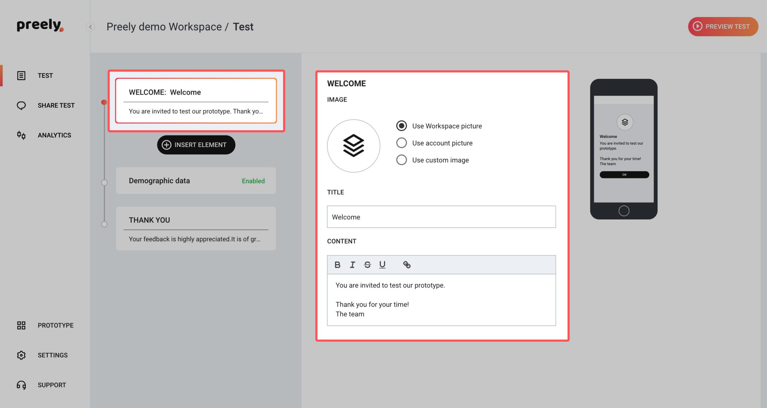
1. Welcome your participants
We have written a short welcome to your participants. If you want to change it, just write your own personal welcome.
2. Add tasks and questions
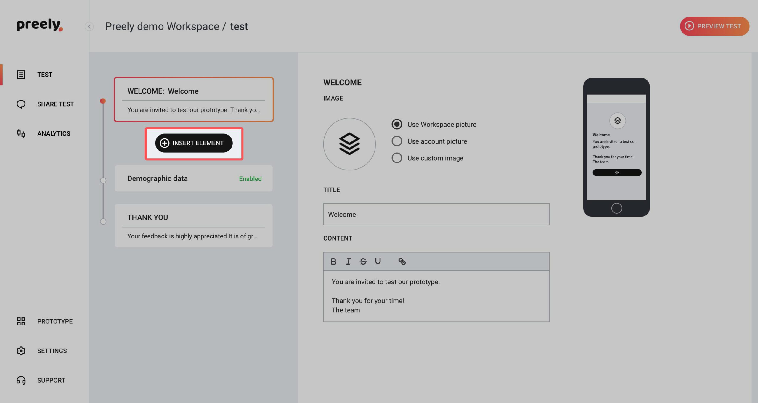
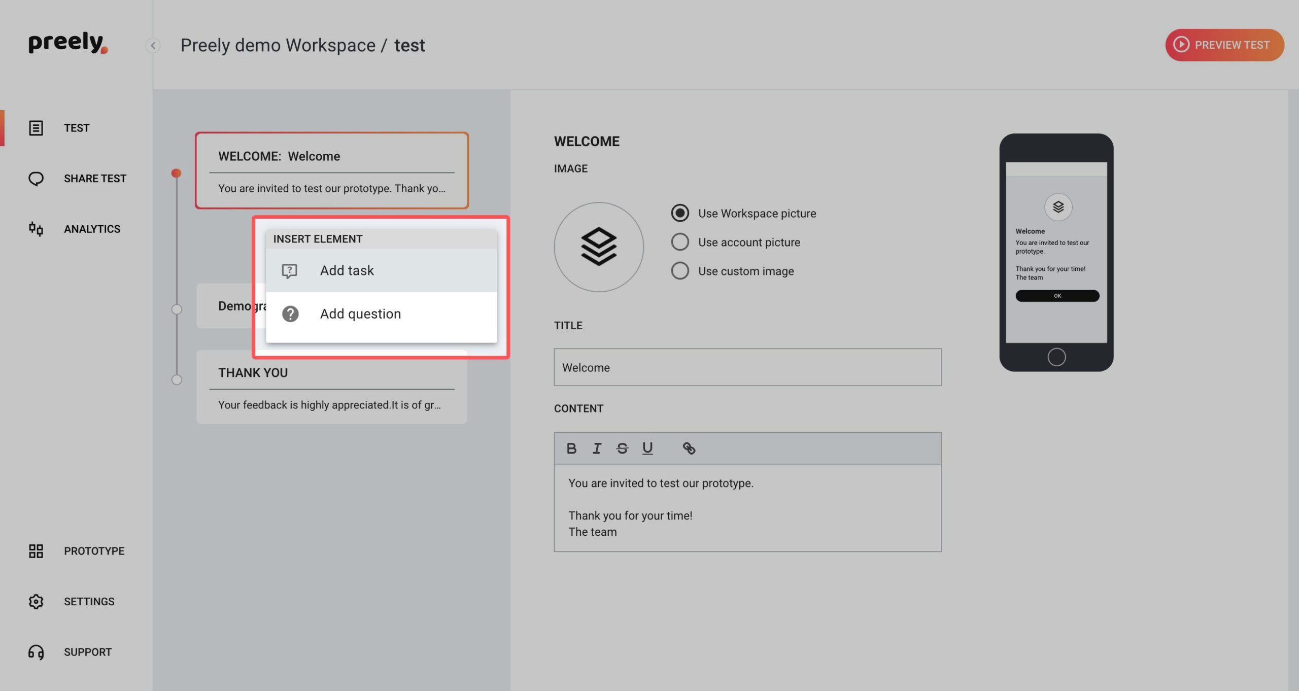
This is where you truly set up your test. Click ‘Insert element’ and create different tasks and ask your participants questions.
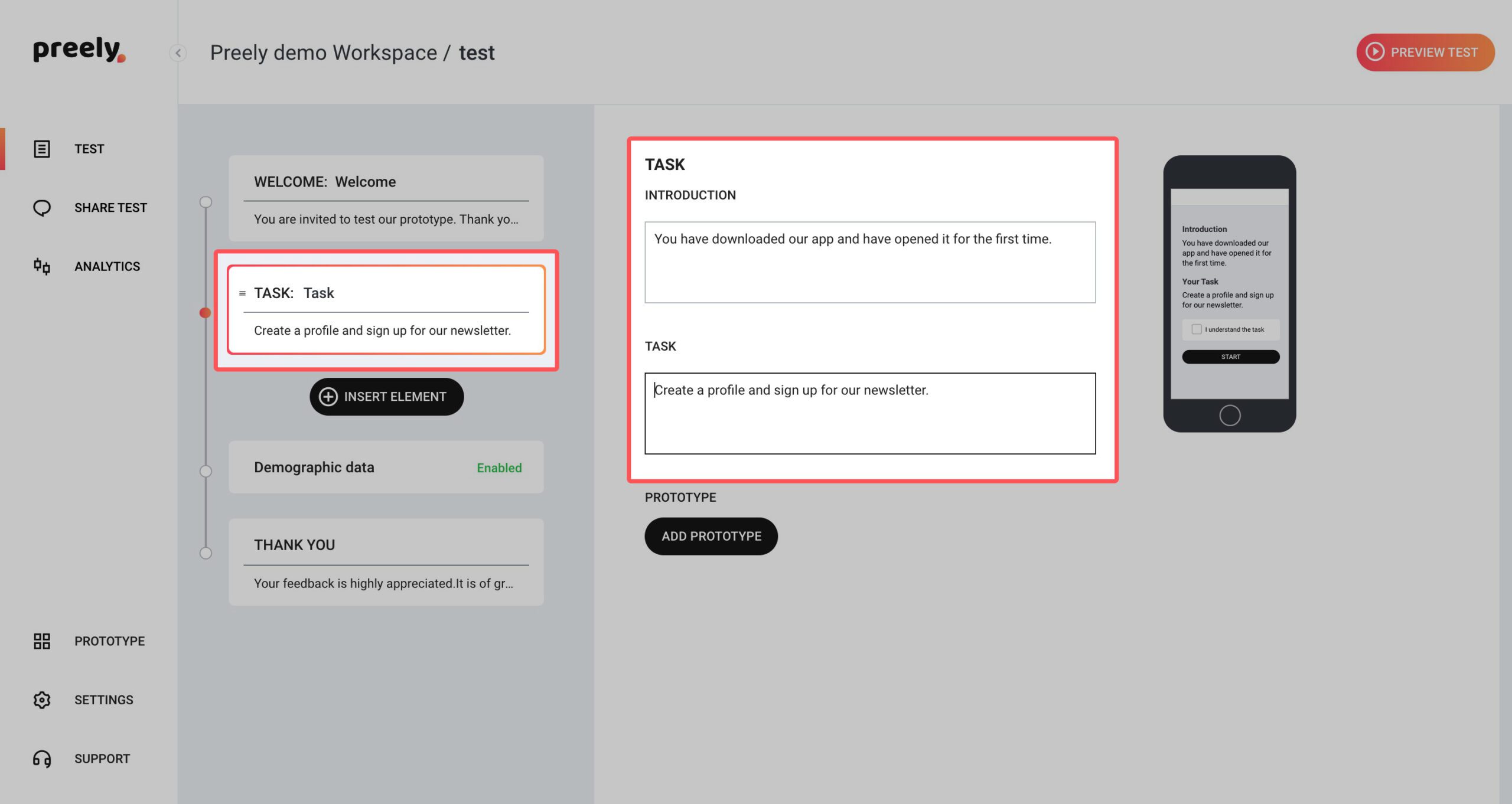
2.1 Tasks
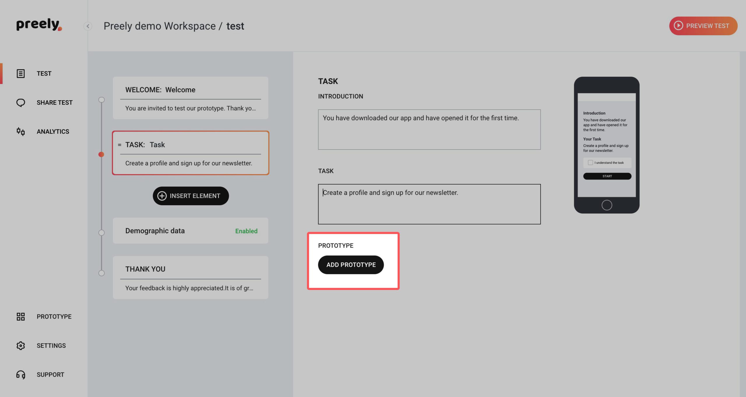
When you want your participants to perform a task in your test, you add a task to your test. You write an introduction and then you formulate the task. Try to break down your tasks into small chunks.
Example:
Introduction: We are testing different design options.
Task: You are going to see different designs for 10 sec. afterward we are asking you different questions about your experience.
2.2 Add prototype
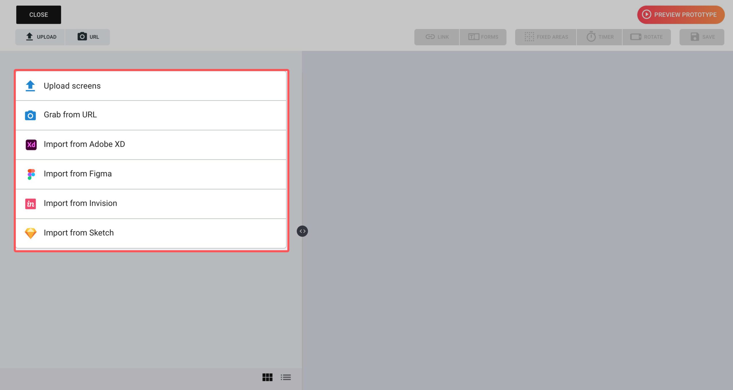
Click Add prototype and upload your design(s), screenshot, Adobe XD-, Figma- or Sketch artboards.
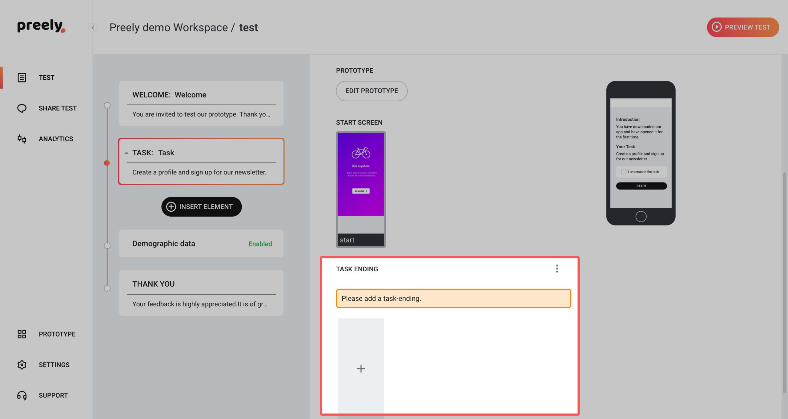
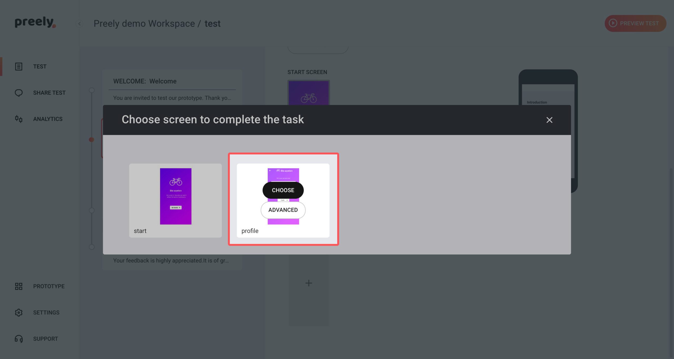
Remember to set an end screen on your tasks. This can either be a:
‘Endpoint’: This means that your participants should click on this certain spot in your prototype to end the task
‘Timer’: This means that you set a timer on the last screen in your test and after a set amount of time, the task is ended
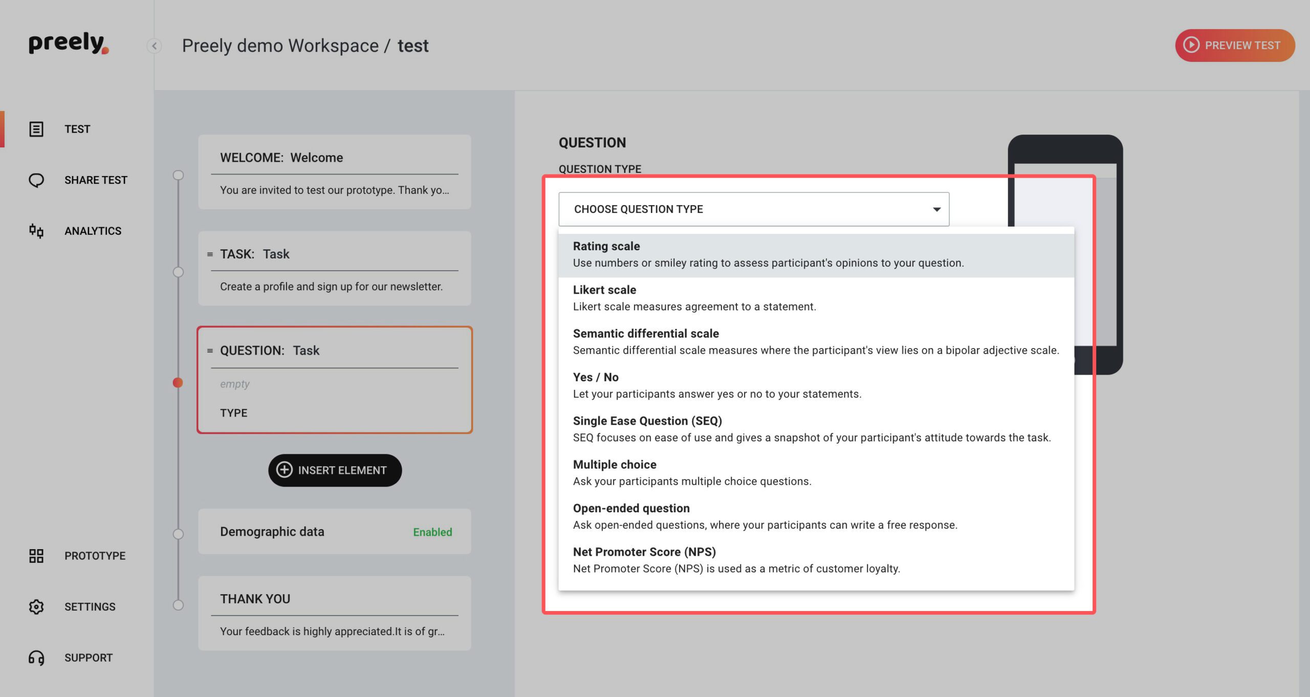
2.2 Questions
When you want to ask your participant questions in your test, you add questions to your test.
Example of question:
- How easy was it to find the mail address? Answer type: Rating (Semantic Differential Scale). Labels: Very difficult – Very Easy
- Consider adding a follow-up question: Why did you give this rating?
Step 4. Analytics:
Success rate:
If the participant can perform the task or not.
Time on task:
How long it took the participants to complete the task.
Number of Paths:
Number of paths indicates if the participants are confused and have been looking multiple places before completing the task. The different paths are good indicators for the participants’ mental models (together with Actions).
Actions:
Here you can see how your participants have clicked throughout your prototype. This gives a very good indicator of the participant’s mental model (together with paths).
Screen statistics:
- Avg. time to first action: Indicates how big the participants’ cognitive strain have been
- Total visits compared to Unique visits: When the Total number of visits is high compared to Unique visits, this indicates confusion af where the participants have been searching and maybe they have started over. To this you can add Avg. time on screen as a good indicator for how difficult the task was
- Hotspot hit ratio: We want this high. If it’s low your participants have struggled in finding their way around your prototype
- Top 3 next screens: Great source for where your participants have been looking for relevant information
Note: You can click on the different Link spots and see how many have click in that specific area.
Paths:
Often designers have an ideal path in mind when designing a digital product. Number of paths indicates if the participants are confused and have been looking multiple places before completing the task. The different paths are good indicators for the participants’ mental models.
