Can you conduct remote user tests when you develop medical devices? Yes! Three graduate engineers in Health Technology at Aarhus University, has as part of their bachelor project developed a monitor that can be used during the internal transport of sick babies at Aarhus University Hospital (AUH) – and they used Preely for their user tests. We have been in contact to hear more about the project.
We are happy that Celia Nielsen, Thea Plenus Kjeldahl Kristensen, and Jenny Thuy Dung Tran, all graduate students from Health Technology at Aarhus University, were up for sharing their experiences with working with Preely in the complex space of medical devices. They have used Preely to test a monitor, they have developed, which can be used during the internal transport of sick babies at Aarhus University Hospital (AUH).
Let’s give the word to the students.
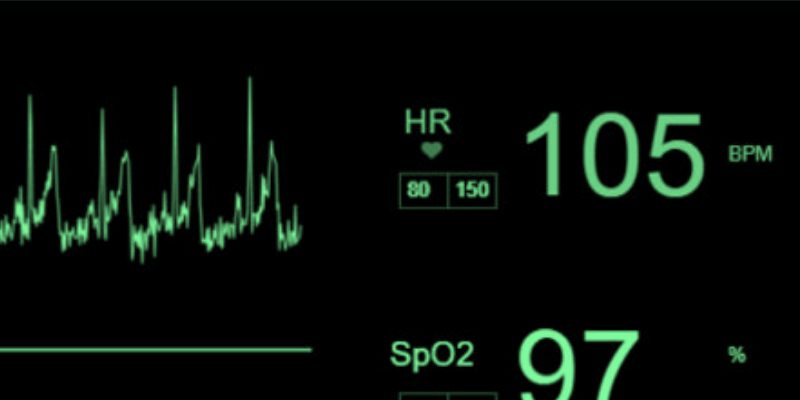
The monitor presents physiological parameters of the baby, which are important indicators if the baby needs urgent treatment during internal transportation. Therefore, it is important that the values are presented clearly, and the functionality is intuitive to the user.
How Preely was used
During development we had to verify the design of the user interface, to test our assumptions and get new inputs that could increase usability. For this, we used Preely to create external user tests, which has made it easy and fast to collect feedback from multiple users.
The tests are created by inserting screenshots of the monitor’s user interface windows. For each window, we created tasks and questions that the user had to answer, for example clicking on the user interface that was thought to be the answer for the task.
The test was easy to share with the participants via a unique link. After test submission, we could access information on how the individual users had answered, as well as get an overview of the average of answers.
When Preely was used
Preely was used both early and late to the design phase. This is because we have had three test groups, and in between made design changes. The first test group was students from our own field of study. Second were people with or in the process of a health professional education, and finally we tested on a group of the neonatal staff from AUH, who are our end users.
By testing our design in three test groups, we got new and different inputs that we might not have gotten if we had tested the design with the same test group several times.

What we tested with Preely
In the test, tasks were set up that reflect the usage scenarios, to see how intuitive it was for the user.
Tasks in the test:
1. Start the measurement
2. Select the values for heart rate and oxygen saturation
3. Select the values for the alarm thresholds
4. Adjusting the alarm thresholds
5. Mute alarm
6. Stop the measurement
7. Navigate to an overview of the measurements and triggered alarms
8. Select the list of triggered alarms
In the test the users had the opportunity to provide feedback both along the way and at the end. This way we could both collect thoughts that the participant had for a specific task and what their overall impression of the user interface was.
The results from the test were analyzed, where the focus area was to look at the time spent for each task and the number of clicks the participant used. Based on this, we could interpret how intuitive the design was and how easy/hard it was for the participants to solve the tasks. In addition, the comments were also used as input for design changes and validation of our assumptions.
The benefits of using Preely
A great benefit of using Preely is that the test is super easy to share. This allows you to quickly collect some feedback in your design phase, which is a crucial element in achieving user-friendly designs. Especially during this time with corona, which limited how many we could seek out to test our product, Preely made it possible to collect a large portion of feedback.
Another great benefit is that Preely makes it possible to see where each individual participant has clicked on the screen, how many times and how long it takes to solve the task. These parameters are interesting to look at when you want to design a user-friendly user interface, as you thus gain insight into how the user will solve the task at first instinct.
Preely was easy to use, and the few things we were in doubt about, we could quickly get help and answers by writing in the chat. They also offer three employees to test your test, so it can be tested before it is sent out to other users.
What we have gained from using Preely
Preely has played a major role in the development of our design for the monitor. It has given us insight into what worked and what did not. And based on this we have made changes and adapted the design so that users find it more user-friendly.
The evolution of the design of the primary user interface can be seen in the image above.
Thea Plenus Kjeldahl Kristensen, Celia Nielsen and Jenny Thuy Dung Tran


