In Blog, Cases, Design & Product, User panel and feedback
Meet the Heroes of UX: Jeppe Henckel, Senior UX Designer & Team Lead
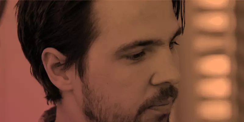
Welcome to this months The Heroes of UX portrait with Senior UX Designer & Team Lead, Jeppe Henckel.
With 10 years in UX- and strategic design, Jeppe Henckel (LinkedIn) has helped countless of companies solving business-critical problems with design. Jeppe has previously been employed as a Principal Designer at the global design company “Frog Design” and as User experience lead at Hello Group, where he worked on some of Denmark’s most successful apps and websites. Jeppe now works as an independent freelance designer.
In this portrait, Jeppe will discuss his take on UX design in 2018 and the future. For Jeppe, the importance of UXer designing screens has long since been replaced by a more complex role in the modern organization as an enabler of bringing good experiences to customers. Learn more about what this entitles for you as a UX professional, and what Jeppe predicts for the future of UX right here.
What is your take on UX anno 2018?
I see UX increasingly becoming less about designing specific screens or functionality and more about directing and enabling the making of digital products and experiences. When we talk about web and mobile (which most of us still work with) the patterns and best practices have become so established that most of the building blocks we need can be pulled right off the shelf. That means that we as designers can focus more on enabling teams and organizations to maintain and continually improve their services, which is a very different task than designing and delivering a specific app or piece of software.
For example, when we create good design systems, we enable development teams to roll out simple functionality with very little involvement from UX. When we establish clear processes for customer feedback loops, we allow product managers to make the right decisions on what to build and what not to build.
Therefore, by making ourselves less critical in some parts of the creation process, we can focus on the vital and challenging aspects of bringing good services to the users – and it is my experience that the making of the screen is the simple part of this process. Aligning people, understanding organizational capabilities, evangelizing customer-centricity, convincing stakeholders, and consolidating requirements is a much more important and complex job.
As a UX Designer, what methods do you apply to ensure a “user first” perspective?
When talking about user insights, I find it useful to divide tools and approach into two different tracks: broad research and narrow research. Broad research is typically used to understand the goals, ambitions, and contexts of your users. Broad research can inform your overall product strategy and what you decide to build for your users. It is not about asking them what they want, but understanding what they need.
Then secondly there is the narrow track which is much more specific and is used to answer known questions and assumptions about the needs and wants regarding a particular challenge or a particular tool.
For the broad research, the ethnological tools of observations, immersion, and conversation are still the best. For narrow research, I am a huge fan of building and testing and building and testing. Both in the conceptual stages where you test early mocks and low fidelity prototypes and in the phase where your product is live, and you keep learning from users’ actual behavior
How do you communicate the value of user testing and your results to stakeholders?
I think this is actually about creating evidence-aware cultures. In most meeting and boardrooms you will often hear (and sometimes present) assumptions as facts:
“Our customers love x.”
“People don’t know how to use y.”
“People say that they need z.”
Creating an evidence-aware culture is about calling out assumptions as assumptions. Understanding which of your decisions that are based on assumptions will allow you to:
- Understand if the assumption is critical to the success of the product
- Understand what evidence is available to support the assumption
- Decide if more tests and research is needed.
If above becomes a habit, user testing will become a tool to make business and product decisions, and in that way, the value will grow evident to the organization. You will start to test the right things, and everyone will know that testing is not about deciding if a button should be blue or red.
An evidence-aware culture and approach to evaluating assumptions can also further mitigate another problem I often see. In organizations where feedback come from different people and channels, one of your important stakeholders might learn about an issue from a single customer. Consequently, this single occurrence gets presented as an overarching critical customer problem that urgently needs to be solved, and resources are demanded to be directed there.
Instead of directing all resources to address this alleged problem, the action should be to understand the single issue is a recurrent problem and prioritize it against all the other challenges and opportunities. An evidence-aware culture will do just that.
Above doesn’t mean that we need statistical and empirical evidence for all decisions as this will bring progress to a complete halt. Instead, it says that we should be aware of what assumption we are basing our decisions on.
Do you often experience conflict between business needs and user needs when designing?
Even though ‘user’ is embedded in our job title this doesn’t mean that we should try to solve all user problems with our designs. A user problem is only relevant when solving it will have a direct or indirect positive business impact. With that perspective, the real conflict happens if stakeholders in your organization don’t believe that addressing a specific user need will have a positive business impact. Solving that conflict requires compelling argumentation, an understanding of how to build a business case and often a test case with a cheap proof of concept.
In the end, though, it is near impossible to create excellent and innovative digital products if there aren’t key stakeholders buying into the premise that solving user problems inherently is good business.
Do you see any trends transforming the UX field as we know it?
As stated earlier I see UX as being less and less about designing static screens. So if you are a sit-at-the-desk-designer churning out mockups based on design patterns, best practices, and gut feeling… Then you’re in trouble.
For the rest of us, we will need to adapt to the changing landscape (as we have done many times already). We will still be required to understand and emphasize with humans to create a more human-friendly world. I predict that a lot of designers will be needed to create a human-friendly world as technology breaks free from the screens and become more embedded into our lives (think AI, IoT, Voice, AR, VR).
The interactions we will be designing will be more like real two-way interactions instead of us forcing a person to solve a task with a somewhat stiff and static piece of software (however well designed it might be).
To achieve so, we will require new tools and methods, and I expect that the design discipline will need to tie even closer to tech, brand, and business. But it’s going to be exciting!
Are you working on any exciting projects that you would like to share?
I am currently working with Danske Bank on creating a new financial platform for business customers. Business customers have very complex financial needs that are now solved by a myriad of different tools and systems that don’t connect and work together. The constellation of many tools means a lot of manual work must be done to import, export, and consolidate information to get the insights needed to make right decisions.
The platform we are building is designed to enable the users to connect their financial data and also to allow for other non-Danske Bank players to expose their functionality inside the platform.
It is a project that has the opportunity to transform the role the bank plays in their customer’s lives, and helping to drive that transformation is extremely exciting.
Any previous projects you are especially proud of?
I love doing design work that pushes and transform the way a company operates to provide more meaningful and delightful experiences for their users. Helping create IKEAs first connected product, was exciting, not just because of the scale of IKEA, but also since it was helping to build new digital competencies inside a decidedly non-digital company. The work for Bestseller and Jack & Jones is also an example of how you can use technology to improve processes inside an organization – that results in much better customer experiences in the physical stores. These are just two of several projects that I’m proud of.
What is the secret to creating great digital products?
The short answer would be to understand how the sausage is made. Concepting, designing, building, selling, supporting and maintaining a digital product is an incredibly complex endeavor with a lot of different disciplines and crafts needed to be successful. So, a designer needs to be aware of all of all these elements to be able to concept and design a product that fits with the organizational capabilities and strategy – and that is where I see a lot of designs fall short. They are created in a vacuum where they might look and appear great, but they don’t consider all of the organizational constraints that might hinder the product from ever seeing the light of day. Aspirational design created without restrictions belong on Dribble, whereas great design should reside in the real world.
Check out more work from Jeppe on his personal portfolio

